Why Printers
Data are everywhere at universities. Interestingly, Princeton University’s Office of Information Technology publishes the status of every networked printer on campus. Though these data might strike some as uninteresting, I was absolutely fascinated the first time I came across that webpage. Watching printer activity is akin to measuring the average student’s workload. In general, printers are more likely to be active when students have a lot of work, with readings and essays needing to be printed.
The first week of Spring semester, I wrote a Python script to record the status of every printer on Princeton’s campus at 10-minute intervals. The findings are pretty amazing. Check out the below graphs, which give an idea of which printers are most likely to be available.
A big thanks to Nihar Madhavan ‘15 for discovering some interesting patterns and reviewing this post.
Data Collection and Analysis Tools
The scraping script ran for the week of February 3, 2013, with a short period of downtime the night of February 6. I used Python to move the collected data around alongside Matplotlib and Nodebox 3 to render the visualizations.
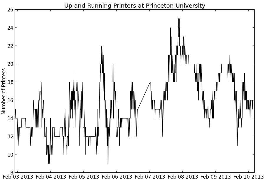
Here’s a plot of the number of printers reported to be “Up and Running” across campus over that week.
Observations
Nihar noticed a few things right off the bat. The printers at Hibben Apartments never returned any data. Considering the buildings’ distance from main campus and old construction, we understood the possible break in connection from that area. Nihar also noted that over this first week of February, only one printer was ever found to report “Consumable Missing”. What exactly is a consumable, we’re not really sure.
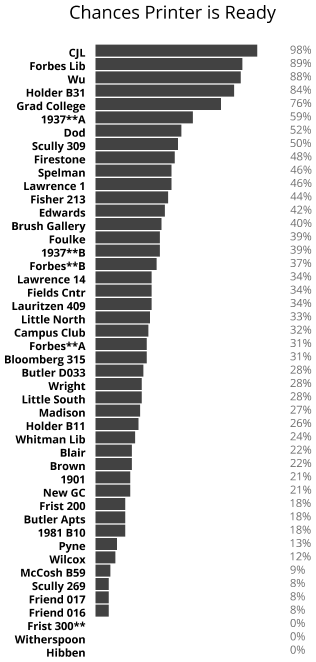
The above graph shows the ranking of campus printers based on the percentage of observations in which they reported to be “Up and Running”. It shouldn’t come as a surprise that the popular Wilcox printers rank low on the list. However, it seems the printer in the nearby Wu library was just third on the list.
The earlier time-series chart seems to show spikes in printer availability during the late-night, early-morning. This is understandable because most students are usually asleep at that hour. It’s unclear whether the global maximum around Thursday night is generally significant for some reason. If anything, we would’ve expected Thursday night to be a busy night with students printing Friday’s problem sets. In any case, it would be worth recording printer data for a few more weeks to observe any weekly patterns.
GitHub
The main Python scripts for this project are available in this GitHub repository.